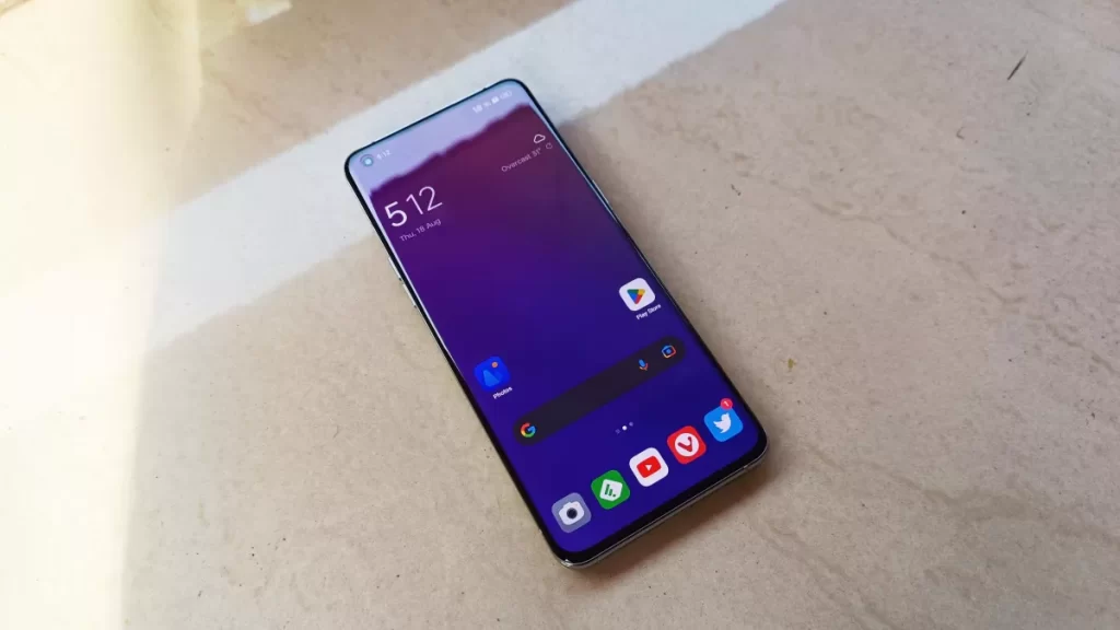
ColorOS 13 is a significant overhaul over ColorOS 12
Oppo has changed quite a few things with the ColorOS 13 update. The new UI is based on Android 13, Oppo changed the naming of ColorOS versions to match Android versions with the debut of ColorOS 11.
ColorOS 12 did not come with many changes over ColorOS 11 and did not resemble much with stock Android 12. But with ColorOS 13, Oppo has changed quite a lot with this update visually, to make it in line with the new design aesthetics of Android 13 by incorporating Material You design into the UI.
COLOROS 13: FEATURES
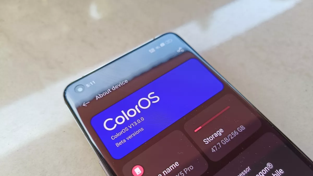
We had early access to ColorOS 13, and I’ve been using the UI for more than a week now. Here are the best features of ColorOS that you should know of, and my thoughts on Oppo’s newest software update.
NOTIFICATION PANEL
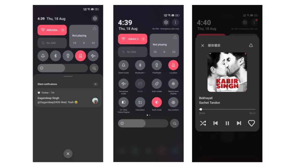
Oppo has entirely changed the notification shade of the skin coming from ColorOS 12. Even though Android 12 introduced a new notification panel style, ColorOS did not implement the same in ColorOS 12. But here, ColorOS 13 borrows some inspiration from the Android 13 notification panel (which is the same as Android 12). The quick settings for Wi-Fi and mobile data follow a rectangular shape while the rest of the quick settings remain unchanged. The notifications section looks exactly like the one from Android 13.
MATERIAL YOU COMES TO COLOROS
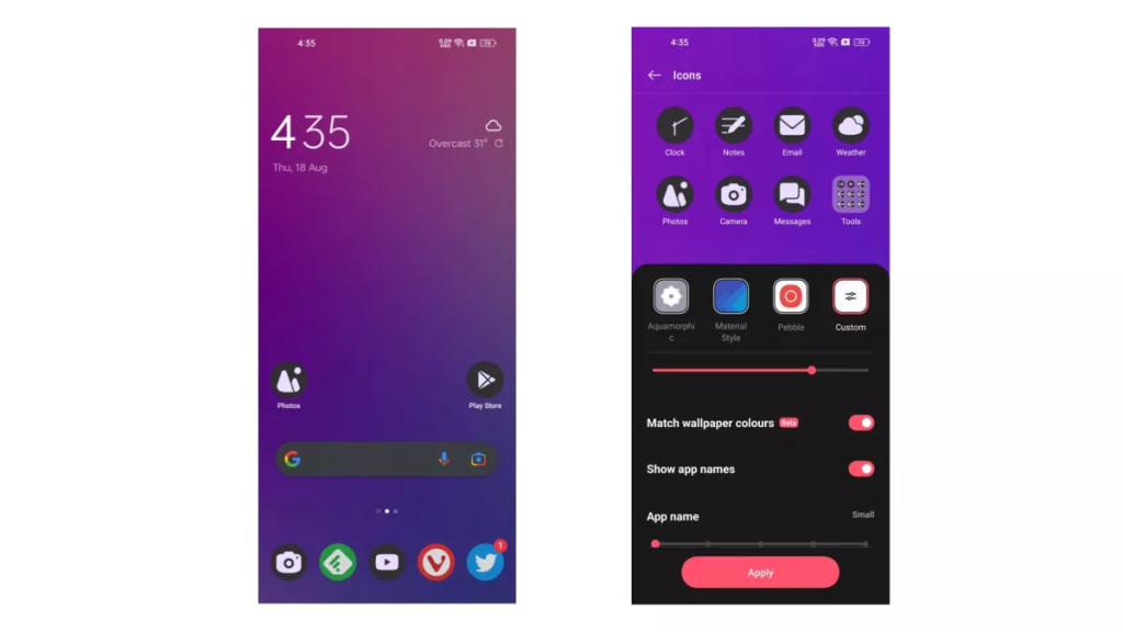
Material You, the main aesthetic change with Android 12 has finally ported over to ColorOS. ColorOS 13 now lets you choose icon colours to match the wallpaper colours. It is not a straightforward option, but you must dive deep into icon settings to enable it. You have to go to the custom option and then select “Match wallpaper colours”.
NEW AOD CUSTOMISATIONS
ColorOS 13 now brings new Always display features that are unseen in any Android skins. It brings Spotify controls to AoD. It not only shows the song that’s currently being played, but you also get Play/Pause/Next controls.
There is also an India-specific feature of Swiggy/Zomato support on AoD. It shows “Order accepted”, “Meal picked up”, “Distance to destination” and “Delivered” updates without waking up the screen.
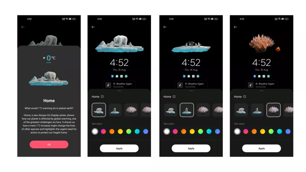
There is a new Home section in AoD settings, which showcases how the climate change affects the earth.
NEW CLIPBOARD
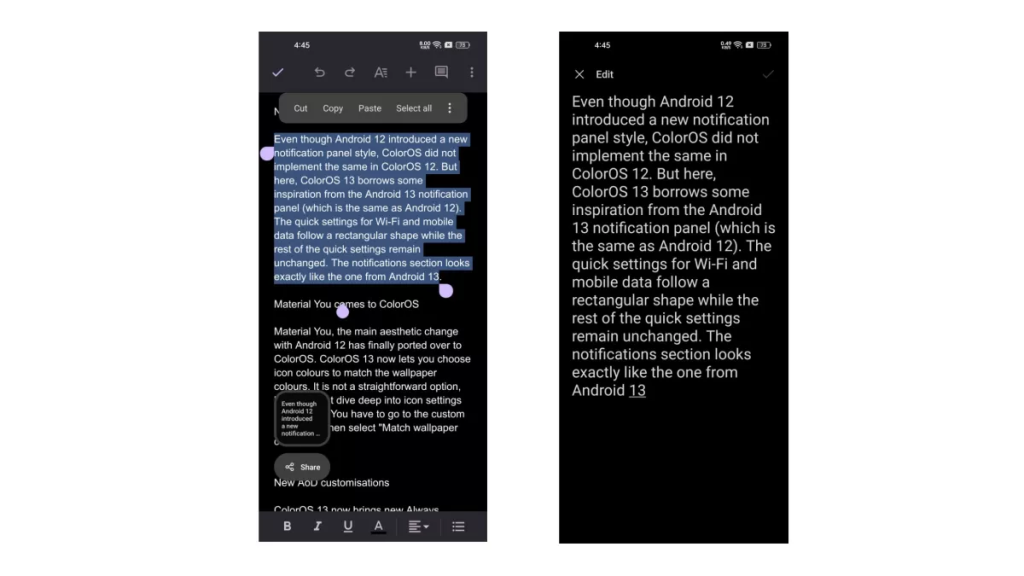
Android 13 brings a new Clipboard functionality with it. Where you get a preview of the text you copied on a small preview window. It also supports the Clipboard security feature where the system auto deletes the copied texts if it contains sensitive info like passwords.
NEW LARGE FOLDERS

The home screen now supports large folders, which look nice and offer better functionality. You don’t need to open the folder to open an app, you can directly click on the icon from the folder to open the app.
BLOSSOM WALLPAPER

SECURITY AND PRIVACY FEATURES
Auto Pixelate

Auto Pixelate reminds users to blur out names and profile pictures from screenshots of chats.
Private safe
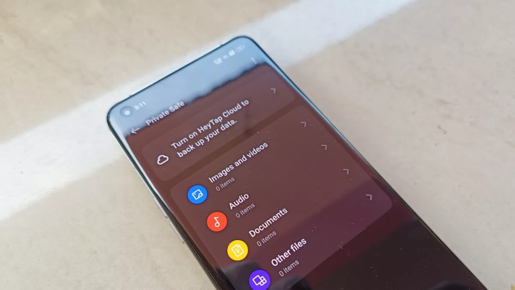
The private safe feature lets you save images, videos, audio, documents and other files in an AES encrypted format. You can access it with a fingerprint or a privacy password.
COLOROS 13: BEST ITERATION OF THE SKIN YET?
ColorOS has come a long way, it was once one of the most hated custom skins by the enthusiast community. It is now one of the best custom skins in my opinion. Not just that, it now also powers RealmeUI and OxygenOS.
Having used the skin for over a week now, it can be easily said that ColorOS 13 is the best iteration of the skin yet. The new design is modern yet fluid and comes with many new useful features.
It will not only make the experience better for Oppo users, but it will also be refreshing the user experience of Realme and OnePlus users.
ColorOS 13 is available right now in beta for Oppo Find X5 and Oppo Find X5 Pro. It will be available for more devices in the coming month.
Image Credits: Techradar
